What to look for
There are a few basic things to look for in the GC data.:
1)Does the graph look weird? Your memory should look like our first graph below: moving up and down as GC takes place. The moving of the total heap is a new thing with WebSphere 6.1.
2)Durations should never be more than 2.5 seconds. If they are, you should look at selecting a different type of GC or adding more threads to the current GC.
3)After heap collection should not trend up. With the latest version of the tool (as of last week), they have added a "Used Heap (after global collection)" option under "VGC Heap Data" to make this more clear.
4)Frequency of Full GCs and tuning. These are the big drops in the before and after heap. Since they take the longest time to happen, they should not happen several times a minute. Also if you are running a 24 hour longevity, you should have several GCs occur, otherwise the heap size it too high. Below you will also see other indications.
Standard Graphs
When analyzing Garbage Collection, there are two main graphs I like to do. The overall heap and duration.
Once you've opened up your GC file. Go under "VGC Heap Data" and select: "Heap size" and both "Used heap" options:

For the duration graph, clear out the selections and select "Pause times" under "VGC Pause Data":

More detailed graphs
The standard graphs are pretty good for identifying basic issues but the real power of the tool is the ability to show all three types of memory.
Overall:

Nursery or Young (I've kept the total heap in the graph so the scales are comparable):

Tenured (I've kept the total heap in the graph so the scales are comparable):

Permanent(I've kept the total heap in the graph so the scales are comparable):

From the graphs, you can see there is no leak happening but it still looks kind of strange. This is due to the compaction going on in the JVM. It is actually tuning itself with WebSphere 6.1. If you look at the graphs, you can see that permanent memory never grows but its total size was set many times above what its actual usage was. This could easily be tuned to use less. The tenured is also set much higher and could also be trimmed.
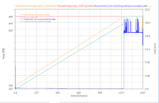
Now that you've seen some graphs with no or minor issue, we'll see what a bad one looks like. Here you can see the Tenured heap rise until it hits its max after several hours, then you can see the durations jump up to over 18 seconds! If you look at the logs, you should also see an Out Of Memory message.

Reports
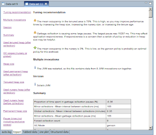
Another nice thing about this tool is the reports and analysis that is does. If you go to the report tab, you can see a report of all the options you have selected from "VGC Pause Data", "VGC Data", "VGC Heap Data." This is a good report to hand out since it is east to generate, but doesn't show the overlapping of any of the graphs like we did above. So if you are trying to illustrate a point, I would output the images from above by right clicking the graph and saving them as an image. To output the report, right click on it and select save. This will be saved as an HTML files with images. Make sure to put it in a new folder or the files will clutter which ever folder you pick.

Tips
* Clear the nativestdout files before running your test or you will need to adjust the time scale
* To zoom in, time in times on the right (do not try to zoom since it will most likely show a blank graph and might freeze up)
* The time won't be clock time, it will be based on the time the server started. You can only adjust the scale such as ms, seconds or days.
* If you see a funny graph with crisscross lines like the following:

This is most likely due to the app being recycled. Turn on "JVM Restarts" under "VGCData." You will be able to see when or if the app was recycled. Also, if you do thread dumps during the run, this can cause issues.

No comments:
Post a Comment